


A Rhythmic Dance with 36 Days of Type
Dec 7, 2023
Celebrating 36 Days of Type
Every spring, a wave of anticipation sweeps through the creative community as the "36 Days of Type" challenge commences, drawing artists around the world into a vibrant and joyous event. Our team at Type Forward eagerly awaits this annual tradition, participating and celebrating with enthusiasm.
For the past few years, we have consistently taken part in the event, recognizing its power to deepen our connection to the rich, varied world of design.


Journey Through Type World
Since its beginning in 2014, "36 Days of Type" has blossomed into more than an annual challenge — it's an emotional and creative journey, enchanting designers, illustrators, and artists worldwide. Participants are invited to interpret and design one letter or number per day over 36 days, presenting their unique perspectives on Latin alphabet characters and numbers. The resulting designs are as varied and imaginative as the creators themselves.


The beauty of this event is evident in its ability to unify professionals and hobbyists alike, offering a blank canvas in the form of a character and allowing artists to express their vision through bold colors, innovative techniques, and new styles.
In the forthcoming passages, we unravel our creative process, nurturing a hope that it might ignite in you a spark of the boundless passion that the world of typography has elicited in us.
Progress Through The Years
Participating in "36 Days of Type" has been a journey marked by exploration, learning, and evolution for our team at Type Forward. From our initial engagements, where we marveled at the myriad ways each letter could be envisioned, to progressively deepening our exploration into the realms of type design, each year has been a chapter of growth and discovery.
In our earlier years of participation, our approaches were primarily focused on exploring various styles and interpretations, ensuring each character we crafted was unique. It was a playful adventure into styles, colors, and form, providing a platform to experiment and explore without boundaries.


As our journey through "36 Days of Type" unfolded, our curiosity led us to dive deeper into the intricate and fascinating world of typography. The 2022 challenge became a pivotal moment in our exploration, steering us toward the enchanting world of variable fonts.
The 2023 challenge was another step into a previously unexplored realm: the intersection of visual design and auditory experience.
This year was not only about the visual dynamics of typography but also about how it could dance in harmony with sound, creating a blend of sensory experiences. Voyaging into the untapped domain of sound integration, melding visual and auditory experiences, we offered our contribution to this widely cherished event.
This journey outlines a progressive evolution, each step informed by the learnings of the previous, each year an exploration deeper into the enchanting world of type.
Exploring Dynamic Variable Fonts
We began that challenge by designing each letter in a different style, which expanded our understanding of the infinite possibilities in shaping each letter. This experiment broadened our spectrum immensely, but diving into "36 Days of Type 2022" unveiled the new and mesmerizing world of variable fonts, a significant breakthrough in the domain of type design. This innovative technology merges various styles and weights into a singular dynamic file, endowing them with a transformative ability to articulate a spectrum of emotions and messages through subtle alterations.


Imagine a universe where each letter isn’t merely static but is instead infused with a lively, evolving spirit. Our recent endeavors revealed this domain, where each day brought a new animated character to life, extending beyond mere static representation. We immersed ourselves in the captivating arena of variable fonts, enabling each letterform to showcase not only a visual aesthetic but also to pose a whispered inquiry: What narrative might it unveil next? This technological interaction evolved from being merely a tool into becoming a muse, guiding our artistic direction, and offering our creations a life of their own. While the potential of variable fonts had begun to influence our design thinking significantly, the subsequent question was unavoidable: How could we breathe life into these dynamic entities?
Animating Letters with Code
This query propelled us to delve deeper, fusing code with design to facilitate a literal animation of typography. By harnessing the transformative potential of variable fonts, we endowed each letterform with a dynamic presence, leveraging the powerful yet straightforward capabilities of HTML and CSS for animation. We transformed static glyphs into pulsating, rhythmic entities, whereby each letter breathed life into our digital canvas and sparked playful exploration within the typographical arena.
<html>
<head>
<!-- Create a "breathe" animation effect using variable font -->
<style>
/* The @font-face rule is used to define a custom font to be used. */
/* Here 'TheFont' is a name we give to reference the font later in CSS. */
/* The 'src' property specifies the path to the font file, */
/* and 'format' specifies the font format. */
@font-face {
font-family: 'TheFont';
/* Variable fonts like the one linked below */
/* allow for fine-tuned control over various font properties dynamically via CSS, */
/* such as weight ('wght'), width ('wdth'), etc. */
/* This link is where your web browser will download the font from. */
src: url('https://garet.typeforward.com/assets/fonts/shared/TFMixVF.woff2')
format('woff2');
}
body.breathe-animation {
display: flex;
align-items: center;
justify-content: center;
/* Change the Background color of the entire screen */
background-color: black;
/* 'vw' is a viewport-width unit, 'vh' is a viewport-height unit. */
/* 1vw equals 1% of the width of the viewport, */
/* and 1vh equals 1% of the height of the viewport. */
/* This allows the font size to scale dynamically with the window size. */
height: 100vh;
}
.breathe-animation span {
font-family: 'TheFont';
/* The 'clamp()' function sets a flexible font size that will never go below a minimum value and never above a maximum value. */
/* The middle value is preferred, but it will shrink or grow based on the viewport dimensions. */
/* Adjusts font size based on content width and viewport height */
font-size: clamp(10vw, 20vw, 50vh);
/* Change this to set the text color */
color: white;
/* Center text horizontally */
text-align: center;
/* The 'animation' property applies the 'letter-breathe' keyframes to the element, making it animate over 3 seconds.'ease-in-out' makes the movement start and end slowly, and 'infinite' makes it repeat forever. */
/* Controls the animation (3s is the duration) */
animation: letter-breathe 3s ease-in-out infinite;
}
/* Keyframes define the sequence of styles that an element will go through during an animation. */
@keyframes letter-breathe {
/* The 'from' and 'to' keyframes establish the initial and final states of the animation, respectively, using 'font-variation-settings'. */
/* This CSS property is used with variable fonts to adjust their weight ('wght'), width ('wdth'), etc., during the animation.
from,
to {
/* Starting weight; adjust the numbers according to your specific font */
font-variation-settings: 'wght' 100;
}
/* At the midpoint (50%) of the animation, the font weight changes to 900. */
50% {
/* Ending weight; adjust the numbers according to your specific font */
font-variation-settings: 'wght' 900;
}
}
</style>
</head>
<body class="breathe-animation">
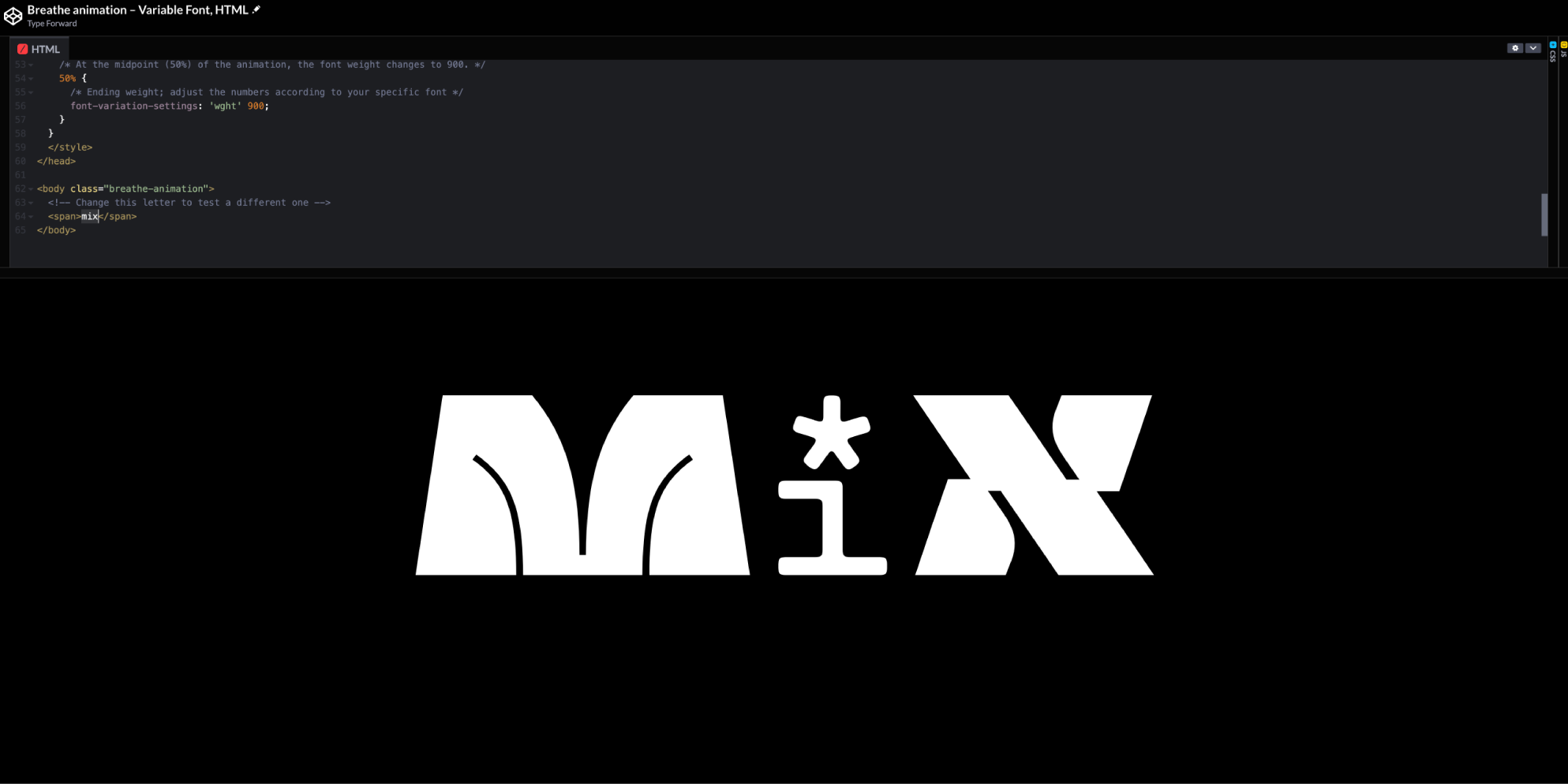
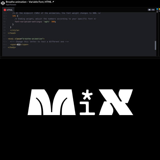
<!-- Change this letter to test a different one -->
<span>A</span>
</body>
</html>For those new to HTML and CSS, let's demystify what’s happening in the code above:
- @font-face & src: These lines of code define a custom font and specify its file location. It’s akin to telling the computer, “Hey, we’re going to use a special font, and this is where you can find it.” To understand more about the @font-face rule, you can read this comprehensive guide at MDN Web Docs.
- body.breathe-animation:This section styles the overall webpage. Imagine the 'body' as the entirety of the page housing your content. We're indicating, “Place our animated letter in the center of the page and set the background to black.” Learn more about body styling and its properties here.
- breathe-animation span: This snippet styles the animated letter, "A.” The 'span' refers to a container housing our letter, specifying its size and color, and linking it to an animation named "letter-breathe.”Here's an insightful resource from Mozilla Developer Network (MDN) about the span element and how it can be used for inline styling.
- @keyframes letter-breathe: Here we define our animation, dubbing it “letter-breathe.” It alters the letter’s “weight” (thickness) in a looping cycle, creating a breathing effect by transitioning between lighter and heavier states. Visualize this as directing the letter to “breathe” by rhythmically thickening and thinning.To dive deeper into CSS animations and keyframes, check out this article.
Through this, each letter is afforded a rhythmic, pulsating life, demonstrating that the nuanced use of code can enliven typography, inviting each character to breathe and pulse in a rhythmic pattern. Feel free to dive into our CodePen, explore the designs that distinguish each letter, and, perhaps, initiate your own experimentations with variable fonts. Remember to play around – change the letters “A” to “Z” and “a” to “z,” and try numerals “0-9” to witness the animation in various forms.
Harmony of Sound and Design
In 2023, our team ventured into new territories, exploring the intimate dance between sound and design. This wasn't solely our story but one sculpted alongside the insightful Matey Devedzhiev, whose adept understanding of animation breathed fresh life into our explorations.
Stepping into the auditory realm was akin to venturing into uncharted lands, where the melodious waves of sound added a new narrative layer to our designs. The character "H," with its whimsical forms and playful ascenders transcended its visual entity; it became a resonant figure where sound and form met in a gentle, explorative dialogue.
This integration opened new avenues, revealing how nuanced sounds could enhance our characters without overshadowing their visual spirit. It presented a learning curve—finding harmonies, striking a balance, and allowing each character to whisper its own unique tune while maintaining visual integrity. The exploration invited us – and we hope, our readers too – to experience typography from a sensory perspective, where each character doesn't just occupy visual space but also hums softly into the auditory realm.
Conclusion
Participating in the '36 Days of Type' has been an exhilarating experience – a journey where each step, every character drawn, and every animation rendered, broadened our horizons in typography and design. Our engagement with variable fonts, the subtle artistry of code, and the harmonic intertwining of sound and design were not endpoints, but passages of discovery and learning.
In sharing our journey, our insights and challenges, and our consistent curiosity, we extend a heartfelt invitation to you: explore the boundless, vibrant universe of type. May your own explorations be sprinkled with moments of wonder, unexpected discoveries, and the pure joy emerging from the act of creation itself.


We invite you to weave your own narrative into the limitless expanse of expressive type, to tell your stories through your letters and creations, and to add your own threads to the vast, digital tapestry of the “36 Days of Type.” May your creativity echo through, not bound by perfection, but liberated in experimentation.
Let’s continue to traverse together in this boundless universe of creative expression, anticipating the extraordinary narratives your explorations will unfurl into the world.